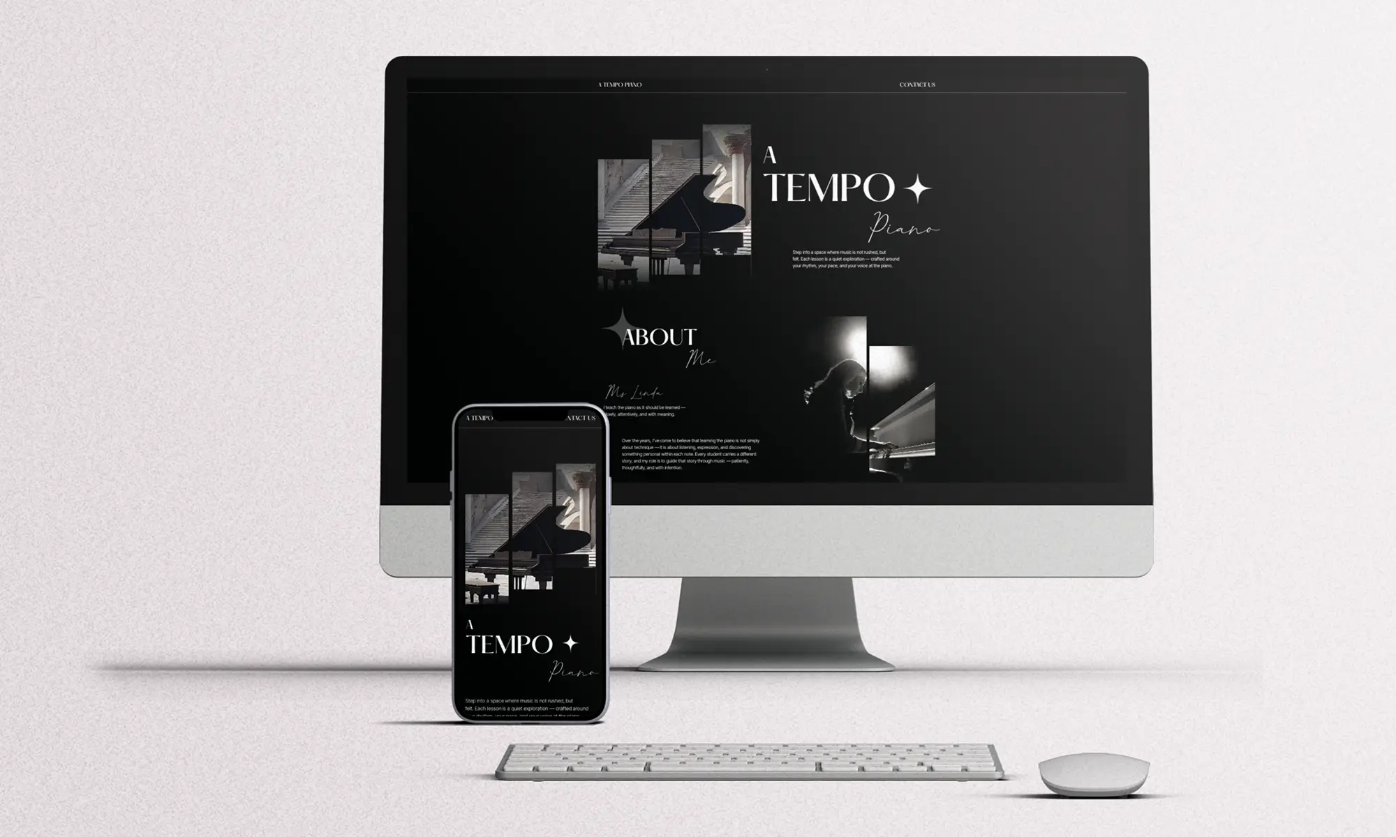
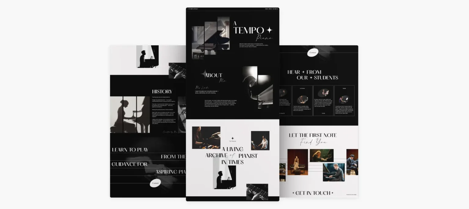
A Tempo Piano is a personal piano teaching studio led by Ms Linda, built around a thoughtful and patient approach to learning music. Rather than focusing solely on technique, the studio emphasises listening, expression and helping each student develop their own musicality.
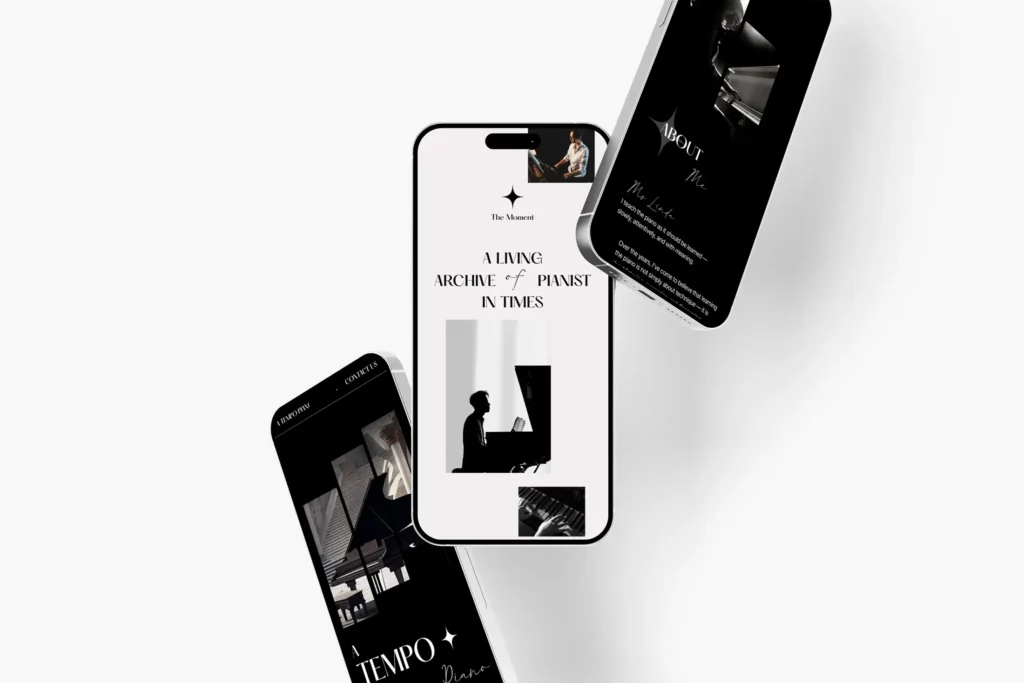
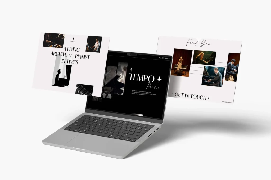
The website was designed to translate this philosophy into a refined digital experience, using editorial-style layouts, expressive typography and carefully selected imagery to create a sense of calm, emotion and musical depth.
Traditional piano teacher websites often focus heavily on class information, schedules and generic education layouts. A Tempo needed something more personal—an experience that could communicate Ms Linda’s teaching philosophy and the emotional side of learning piano.
The challenge was to create a website that felt elegant, artistic and personal, while still making important information and contact points easy for potential students to find.
Our Approach
Rather than creating a conventional piano school website, we approached A Tempo as a personal music portfolio and visual story.
Story First
The website introduces the teacher and her musical philosophy before presenting the lessons, allowing visitors to connect with the person behind A Tempo and understand the learning experience.
Piano-Inspired Identity
The colour palette draws directly from the piano, combining black, white and soft neutral tones to create an elegant, timeless atmosphere that reflects the studio’s artistic character.
Rhythm in Motion
Gentle transitions and minimal animations create a natural browsing rhythm, guiding visitors through the content with the same sense of flow and elegance found in music.
Style Guide
Color Palette
Tempo’s color palette was designed to capture the brand’s calm, thoughtful and expressive personality. A deep black background is complemented by soft peach pink and clean white tones, creating a refined yet warm visual identity that reflects the beauty, emotion and intentionality of learning music while giving the website an elegant and immersive feel.
Full Black
#000000
Soft Peach Pink
#F3EEF0
Full White
#FFFFFF
Typography
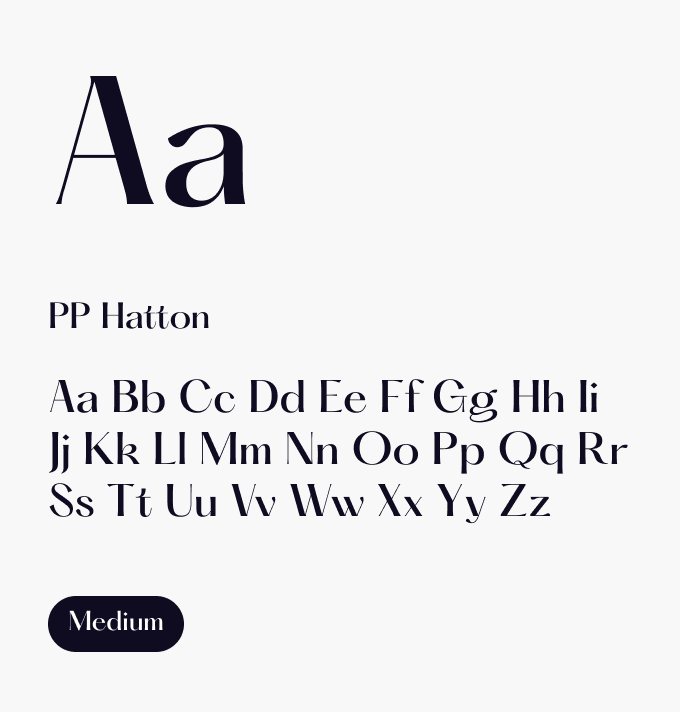
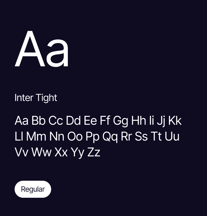
The typography combines PP Hatton for headings to express Tempo’s elegant, artistic and timeless personality, with Inter Tight used for body text and buttons to provide excellent readability and a clean, refined user experience.
The Outcome
We designed an immersive digital experience that reflects the personality and philosophy behind A Tempo Piano.
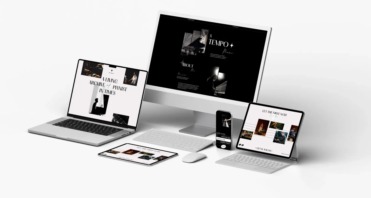
The website takes visitors through Ms Linda’s story, teaching approach, student experiences and visual archive in a calm and editorial-style journey. The combination of expressive typography, imagery and subtle motion gives the website a strong sense of personality while keeping the experience intuitive and focused.
The result is a website that positions A Tempo not simply as a place to learn piano, but as a thoughtful and personal approach to discovering music
What the Website Delivers
A refined and elegant digital presence for A Tempo Piano
Stronger expression of the studio’s artistic identity and teaching philosophy
Piano-inspired branding with black & white visuals and musical note elements
Subtle animations that create a calm, rhythmic browsing experience
Responsive performance across desktop, tablet and mobile
A seamless journey from discovering the studio to making an enquiry
Every brand has its own story to tell. At Zumax Digital, we create websites that combine strategy, creative design and technical expertise to deliver engaging digital experiences tailored to your business.
Whether you’re in food and beverage, retail or professional services, we’re here to help bring your vision to life.