The Role of Colors in Web Design: A Psychological Perspective
Last Updated on August 27, 2025
How to Use Color Effectively In A Web Design?
Have you ever wondered why certain websites make you feel calm and relaxed, while others make you excited and energized? The secret lies in the colors they use. In the world of web design, colors do much more than just make things look pretty—they play a powerful role in shaping your emotions and perceptions.
Understanding the Basics:
Let’s start with the basics. Every color has a unique way of making us feel. For instance:
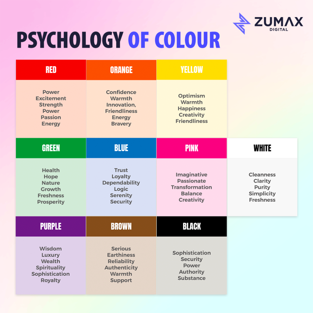
- Blue: When used on a website, it can make visitors feel safe and confident. Many big companies use blue because it gives a sense of reliability.
- Red: It can create a sense of urgency. That’s why you often see red on sale signs or buttons that say “Buy Now.”
- Green: Green is like a walk in the park—it brings a sense of nature. It can make people feel comfortable and peaceful. It’s often used for brands related to health or the environment on a website
- Pink: It makes things feel warm and friendly. People who like a softer, more feminine style often enjoy pink.
- Beige: Beige is a color that works well with many things. It can make things look classy and timeless.
- Yellow: It catches your attention and makes you feel happy. It’s often used to highlight important things.
- Purple: This color gives a sense of elegance and luxury. It’s often used in beauty and creative industries.
- Orange: Orange is lively and friendly. It’s good for making things stand out and giving a friendly vibe.
- Black: Black is a strong color that looks professional. It’s often used for luxury brands.
- White: White is like a blank canvas. It makes other colors stand out and gives a clean and open feeling.
Creating the Right Mood:
When a website uses colors that match its message, it’s like creating a mood for visitors. Imagine a spa website painted in vibrant red. It might not give off the relaxing vibe you’d expect. On the other hand, a financial website using soft blues and greens might make you feel secure and at ease.
Building Trust:
Colors can also affect how much we trust a website. Imagine you’re shopping online for the latest tech gadget. Would you trust a website covered in flashy, neon colors, or one with a clean and professional look? Most likely, the professional one. That’s the psychology of colors at play.
Call to Action (CTA):
Have you ever noticed how “Buy Now” buttons are often red? That’s because red grabs attention and creates a sense of urgency. It’s like saying, “Act now!” On the other hand, a green button might be used for a “Sign Up” action, signaling growth and progress.
Consideration for Different Cultures:
It’s also important to think about cultural differences. In some cultures, certain colors may have specific meanings. For example, white is associated with purity in Western cultures, while it represents mourning in some Eastern cultures.
In the colorful world of web design, it’s not just about picking what looks good—it’s about choosing colors that connect with people on a deeper level. So, the next time you visit a website, pay attention to the colors. They might be speaking to you in ways you never realized.
Remember, colors are like the silent storytellers of the web, shaping our online experiences in ways we might not consciously notice. If you’re in search of a professional web designer Malaysia who understands the psychology behind colors and can create a website that speaks to your audience, look no further.
Visit Zumax Digital today and let us bring your vision to life. Your online success starts with the right colors.
More website examples:
SMC Nigeria Project
JR Sharing